
“If you can’t write
your message in a sentence, you can’t say it in an hour.”
Dianna Booher
A few weeks ago I wrote about PowerPoint (Blame the Tools, It’s Easier). In addition to the idea that PowerPoint “forces” the use of bulleted lists the most common complaint I hear is about images. The use of images in PowerPoint is such a common problem that I have hosted and given workshops on the topic.
When it comes to the use of images in PowerPoint, the critical thing to remember is to maximize the use of space. Unfortunately, this is not always as easy as it might seem. If we assume you are making slides for a presentation, then the available space is determined by the projector, not your computer. Two factors determine the available space of your projector the resolution and aspect ratio.
Resolution is the number of pixels on the screen, while the aspect ratio is the shape of the screen. Fortunately, if your computer has enough processing power to handle your slides (most modern computers do) you only really need to worry about aspect ratio. Your computer will still run your presentation even if your image is too big. If you use the zoom function, magnifying glass on the presenter’s screen or the plus and minus keys, there is even an advantage to using oversize pictures.
With regards to the aspect ratio, most projectors and computer screens have a 16:9 aspect ratio. The 4:3 aspect ratio went out of production for computers sometime around 2012. However, you still might encounter some 4:3 projectors. As a reference today (2019) most Windows-based laptops use the 16:9 aspect ratio while MacBook’s use 16:10.
The first thing to do when designing a presentation is to find out the aspect ratio of the projector you will be using. When researching projectors, you will most likely find the resolution/aspect ratio listed like VGA, XGA, and Full HD. These letters are the abbreviation of a monitor standard. Each standard represents a resolution and aspect ratio. VGA stands for Video Graphics Array and has a resolution of 640 x 480 pixels and an aspect ratio of 4:3. Some common monitor standards you could encounter are
- XGA 1024 x 768 4:3
- 720p 1280 x 720 16:9
- WXGA 1280 x 720 16:9
- WXGA 1280 x 800 16:10
- 1080p 1920 x 1080 16:9
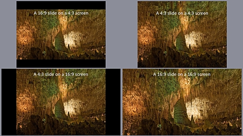
If you encounter other resolution, you can look them up on Wikipedia’s Display resolution page. Alternatively, if all you have is the resolution say 1600 x 1200, you can use an online aspect ratio calculator, 1600 x 1200 (UXGA) has a 4:3 aspect ratio. When you know the aspect ratio of the projector, you can design the slides to fill the screen. Below are four images that show a 16:9 slide on a 4:3 screen and a 4:3 slide on a 4:3 screen than a 4:3 slide on a 16:9 screen and 16:9 slide on a 16:9 screen.
The first thing is to create a presentation that matches your projector. The current default aspect ratio for a PowerPoint presentation is 16:9. PowerPoint users can change the ratio to 4:3; click on Design in the top menu then on the right side of the design bar click slide size and choose 4:3. If you happen to have the 16:10 resolution you will need to click Custom instead of 4:3 then from the Slide Sized dropdown menu choose On Screen Show (16:10). Now that we have our slides setup, we can add images. Under the new slides button, there are six options, several of them will accept images. However, as I said when I talked about the font, making a good presentation is all about defeating the presets and built-in options.
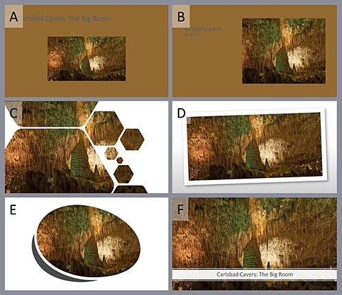
Below are Six options (A-F) that PowerPoint “suggested.” Unless you are teaching a class on design, I am going to assume that the critical content is the image. In this case, the best “default” option is F However; the title box covers up a portion of the image, our primary content.
Instead of a default option, I start with a blank slide and insert an image. If you select the image and then click and hold shift + ctrl (shift + ⌘ mac) and the image will resize from the center evenly along all edges. That will give you the slide below a single picture filling the slide.

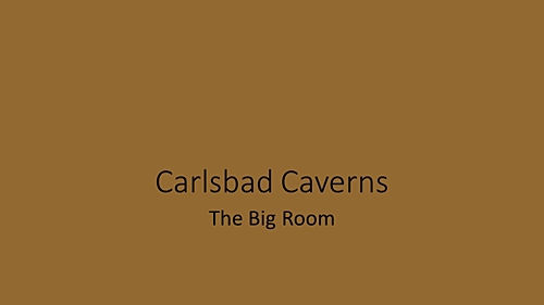
Now we need to add a title the option that leaves the image completely clear is to have the title on the previous slide like the following images.
If you need the title on the image, there are two ways to do it. The first is to insert a text box and find a color that the audience can read on top of the image. Finding a readable text color can be difficult if the image has a lot of different colors and a broad contrast range. When you have found a color that works enter your title. The following image uses white text.

The second and my preferred method of adding text to an image is to insert a text box fill it with a 60 -70% transparent white and then use black text. An example of the translucent text box with black text is below.

The reason I prefer the translucent white text box, it always works, and you can still see the picture. The translucent white generates contrast for the black text on any combination of colors. Because it always works, I can do it in the same way on every slide. When designing slides for a teaching presentation, consistency is essential; your audience will note and be distracted by changes. The only reason you should break consistency is to make a point. However, remember if you break consistency to make a point only do it once or at most twice if your presentation has discrete sections.
Again, this post only covers a single piece of one topic. The selection of color and color palette that works with an image could be another topic all by itself. The idea of consistency could and probably should be expanded to cover all the slides used in a year-long course, not just one presentation. Hopefully, this discussion on images in PowerPoints is helpful. I’m not sure I have gotten PowerPoint out of my system; I may come back to this topic again.
Thanks for Listing to My Musings
The Teaching Cyborg
