Your Student Can Find Supernova

“Look up at the stars and not down at your feet. Try to make sense of what you see, and wonder about what makes the universe exist. Be curious.”
Stephen Hawking

Fifty years ago, humans first set foot on the moon.  In recognition of this, I thought I would discuss how astronomy classes can conduct real astronomy research.  As I have said in many of my posts, most current best practices in STEAM education recommend that students perform real science.

One of the arguments I have repeatedly encountered is that real science requires equipment that is too expensive for student labs.  Nothing could be further from the truth.  While scientific equipment on the cutting edge of science can be costly general improvements in technology, mean that students can use hobby grade instruments for scientific observations.

As an example, digital SLR cameras can be used to find supernova.  As a step up a simple telescope and digital camera like many schools already have can also be used.  Having the equipment fixed in a dedicated spot in a shed or dome that opens is helpful but also not necessary.  Students can also set up the equipment each night to make observations.

The basic technique to find supernova is to take lots of pictures of night sky night after night.  Then compare the images and look for a star (you’re looking at galaxies, not individual stars) that gets brighter or appears where there was not a visible star.  The biggest drawback to the discovery of supernova is simply the amount of data that the students will need.  On the website for BOSS Backyard Observatory Supernova Search under the setting up a search page they list supernova discoveries from several individuals

  • Tim Puckett (one of the largest in the world) ~1 SN every 8000 images (300+ SN)
  • Robert Evens ~ 1 SN every 4000 observations (47 SN)
  • Peter Marples ~ 1 SN per 5000 images (8 SN)
  • Me ~ 1 SN every 2800 images (57 SN)

Using these numbers as a baseline, we would find one supernova on average every 4950 images. If we assume a 15-week semester, the class would have to take 330 pictures per week.  Assuming students take one image every minute, 330 images would take 5.5 hours over one night or 2.75 hours over two nights.   With a class of 25 students, each student would need to examine 198 images or 13-14 images per week.  A better approach would be to have two students review 396 images so that two students separately review each 198-image set. All these numbers seem reasonable for a semester-long class.

Once students capture the images, students analyze the images in one of three methods.  In all methods, you compare the new images you take with a set of reference images.  You can either make your reference images.  Or download reference images from the Digitized Sky Survey (DSS). You then compare your new images to the reference images and look for differences.  The first way to do this is to compare the two images side by side and look for differences.  The second method is to blink the images. The new image is aligned and laid on top of the reference image, and the computer rapidly clicks between them. A free tool to do this is Starblinker.  The third method is automated software, but that can be expensive and is only suitable for projects that collect 1000s or more images a night (there are problems and drawbacks to automated software I will not get into). 

When your students discover a new Supernova (we will assume that if you review enough images, you will be successful.), the students can learn about submitting their discovery to Central Bureau for Astronomical Telegrams. A new supernova report will require the students to take additional images and measurements.

Any scientific research can be used to teach students the basics of research and observation.  The search for and discovery of supernova can be included in everything from a class for nonmajors to a dedicated research seminar.  Additionally, the students that conduct this type of research can be in almost any age group.  When we teach scientific research, it is essential to remember that science is a process and method of looking at the world, not the equipment we use.  So, get out there and find some stars that blew up.

Thanks for Listing to My Musings
The Teaching Cyborg

But I Can’t Use Images in PowerPoint!

“If you can’t write your message in a sentence, you can’t say it in an hour.”
Dianna Booher

A few weeks ago I wrote about PowerPoint (Blame the Tools, It’s Easier).  In addition to the idea that PowerPoint “forces” the use of bulleted lists the most common complaint I hear is about images.  The use of images in PowerPoint is such a common problem that I have hosted and given workshops on the topic.

When it comes to the use of images in PowerPoint, the critical thing to remember is to maximize the use of space. Unfortunately, this is not always as easy as it might seem.  If we assume you are making slides for a presentation, then the available space is determined by the projector, not your computer.  Two factors determine the available space of your projector the resolution and aspect ratio.

Resolution is the number of pixels on the screen, while the aspect ratio is the shape of the screen.  Fortunately, if your computer has enough processing power to handle your slides (most modern computers do) you only really need to worry about aspect ratio. Your computer will still run your presentation even if your image is too big.  If you use the zoom function, magnifying glass on the presenter’s screen or the plus and minus keys, there is even an advantage to using oversize pictures.

With regards to the aspect ratio, most projectors and computer screens have a 16:9 aspect ratio.  The 4:3 aspect ratio went out of production for computers sometime around 2012.  However, you still might encounter some 4:3 projectors. As a reference today (2019) most Windows-based laptops use the 16:9 aspect ratio while MacBook’s use 16:10.

The first thing to do when designing a presentation is to find out the aspect ratio of the projector you will be using.  When researching projectors, you will most likely find the resolution/aspect ratio listed like VGA, XGA, and Full HD. These letters are the abbreviation of a monitor standard.  Each standard represents a resolution and aspect ratio.  VGA stands for Video Graphics Array and has a resolution of 640 x 480 pixels and an aspect ratio of 4:3. Some common monitor standards you could encounter are

  • XGA        1024 x 768          4:3
  • 720p      1280 x 720          16:9
  • WXGA    1280 x 720          16:9
  • WXGA    1280 x 800          16:10
  • 1080p    1920 x 1080        16:9

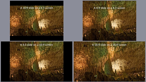
If you encounter other resolution, you can look them up on Wikipedia’s Display resolution page. Alternatively, if all you have is the resolution say 1600 x 1200, you can use an online aspect ratio calculator, 1600 x 1200 (UXGA) has a 4:3 aspect ratio.  When you know the aspect ratio of the projector, you can design the slides to fill the screen.  Below are four images that show a 16:9 slide on a 4:3 screen and a 4:3 slide on a 4:3 screen than a 4:3 slide on a 16:9 screen and 16:9 slide on a 16:9 screen.

4 slides that show 4:3 content on 4:3 and 16:9 slides and 16:9 content on 4:3 and 16:9 slides

The first thing is to create a presentation that matches your projector.  The current default aspect ratio for a PowerPoint presentation is 16:9. PowerPoint users can change the ratio to 4:3; click on Design in the top menu then on the right side of the design bar click slide size and choose 4:3.  If you happen to have the 16:10 resolution you will need to click Custom instead of 4:3 then from the Slide Sized dropdown menu choose On Screen Show (16:10).  Now that we have our slides setup, we can add images.  Under the new slides button, there are six options, several of them will accept images. However, as I said when I talked about the font, making a good presentation is all about defeating the presets and built-in options.

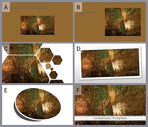
Below are Six options (A-F) that PowerPoint “suggested.”  Unless you are teaching a class on design, I am going to assume that the critical content is the image.  In this case, the best “default” option is F However; the title box covers up a portion of the image, our primary content.

a slide showing 6 default option for image layout in PowerPoint. On Slide F the image completely fills the screen and a white text box displays the title at the bottom.

Instead of a default option, I start with a blank slide and insert an image.  If you select the image and then click and hold shift + ctrl (shift + ⌘ mac) and the image will resize from the center evenly along all edges.  That will give you the slide below a single picture filling the slide.

A slide filed with an image of the Carlsbad Cavern Big room and no text.

Now we need to add a title the option that leaves the image completely clear is to have the title on the previous slide like the following images.

A title slide saying Carlsbad Cavers The Big Room.
A slide filed with an image of the Carlsbad Cavern Big room and no text.

If you need the title on the image, there are two ways to do it.  The first is to insert a text box and find a color that the audience can read on top of the image.  Finding a readable text color can be difficult if the image has a lot of different colors and a broad contrast range.  When you have found a color that works enter your title. The following image uses white text. 

A slide filed with an image of the Carlsbad Cavern Big room and white title text.

The second and my preferred method of adding text to an image is to insert a text box fill it with a 60 -70% transparent white and then use black text.  An example of the translucent text box with black text is below.

A slide filed with an image of the Carlsbad Cavern Big room. With a text box filled with translucent white and black text.

The reason I prefer the translucent white text box, it always works, and you can still see the picture.  The translucent white generates contrast for the black text on any combination of colors.  Because it always works, I can do it in the same way on every slide.  When designing slides for a teaching presentation, consistency is essential; your audience will note and be distracted by changes.   The only reason you should break consistency is to make a point.  However, remember if you break consistency to make a point only do it once or at most twice if your presentation has discrete sections. 

Again, this post only covers a single piece of one topic.  The selection of color and color palette that works with an image could be another topic all by itself.  The idea of consistency could and probably should be expanded to cover all the slides used in a year-long course, not just one presentation.  Hopefully, this discussion on images in PowerPoints is helpful.  I’m not sure I have gotten PowerPoint out of my system; I may come back to this topic again.

Thanks for Listing to My Musings
The Teaching Cyborg
Technology and Plagiarism

“All my best thoughts were stolen by the ancients.”
Ralph Waldo Emerson

Technology and computers have become central components of modern life.  Using word processors has become such a common practice that if asked, most people know what Ctrl-C and Ctrl-V mean.   On the positive side, technology has made writing and research faster. Modern word processors make writing and editing more quickly than typewriters or handwriting.  Modern computers make changing words, correcting spelling, and moving large blocks of text easy and fast.

The internet makes information available in ways that historically would have been unbelievable.  Libraries, museums, and research journals are accessible all over the world through the internet.  The internet allows access to news in real time from all around the world. The internet has become such an essential source of information that there are individuals that say it is necessary for education.

Like most things with benefits come drawbacks.  One of the most significant disadvantages of technology on writing is how easy it is to plagiarize.  It is just as easy to grab text from someone else’s document as it is to move text around your document. Fortunately, like many things’ technology evolves along two fronts. People start reading your documents we developed encryption. Hackers create viruses, spyware, and trojans companies develop anti-virus software.

To counteract the increasing ease of plagiarism tools have been developed to identify it. Many schools are integrating Plagiarism checkers directly into their Learning Management Systems (LMS).  Additionally, using the schools LMS to accept assignment digitally allows for automatic plagiarism detection. In addition to commercial tools today, there are also free tools. The availability of free tools means even if your school does not have a plagiarism checker, you can still make use of one to test your students’ assignments.  However, what does it mean to “check” the material?

Several years ago, the school I was working at had a contract with Turnitin.com.  When faculty sent an assignment to Turnitin.com, the program generated a similarity report.  Turnitin.com uses a 0-100% scale where the percentage is the amount of the paper that is similar to other sources. Faculty would always ask what number means plagiarism. The faculty wanted an exact number, at X% the student committed plagiarism.

Unfortunately, it is not always that clear. Technically a single sentence can be plagiarism.  The previous sentence is seven words long 0.6% of this document, and if I had stolen that sentence, it would be plagiarism.  The definition of Plagiarizing “: to steal and pass off (the ideas or words of another) as one’s own: use (another’s production) without crediting the source” (Merriam-Webster) does not include a word length.  If a writer takes another person’s text and attempts to pass it off as their own, no matter how short or long, it is plagiarism.

However, using the rule that any similarity score is plagiarism can also cause problems.  Most plagiarism checkers will recognize quotes and references.  Beyond that, maybe the writer forgot to add a reference or quotation marks.  Alternatively, there is a limit to how many ways a writer can write something.  Suppose a student is writing a review of a Sherlock Holmes book by Sir Arthur Conan Doyle.  How many ways are there to write a sentence stating where Sherlock lives?

  • Sherlock Holmes lives at 221b Baker Street.
  • Sherlock Holmes lived at 221b Baker Street, London, England.
  • Sherlock Holmes lived in apartment b at 221 Baker street.
  • Sherlock Holmes lived in apartment b at 221 Baker Street, London, England.
  • Sherlock Holmes made his residence at 221b Baker Street.
  • Sherlock Holmes made his residence at 221b Baker Street, London, England.
  • The story began at the residence of Sherlock Holmes at 221b Baker Street.
  • The story began at the residence of Sherlock Holmes at 221b Baker Street, London, England.
  • Sherlock Holmes shared an apartment with Dr. Watson at 221b Baker Street.
  • Sherlock Holmes shared an apartment with Dr. Watson at 221b Baker Street, London, England.

I can quickly come up with ten sentences; I am sure I could come up with more without a lot of work.  I would also be utterly shocked if someone has not written these sentences before.  A Google search using the sentence “Sherlock Holmes lived at 221b Baker Street, London England.” produced 324,000 hits.  The sentence “Sherlock Holmes made his residence at 221b Baker Street.” Produced 443,000 hits. Does this mean I plagiarized them?  Well, I didn’t look them up, I didn’t copy and paste them, I created them from my memory of Sherlock Holmes address. I would say no, this is not plagiarism others might say yes, it is plagiarism.

Perhaps this is a situation in which a direct quote would be better.  With very little research I found that 221b Baker Street first appears in the book A Study in Scarlet,

“We met next day as he had arranged, and inspected the rooms at No. 221B, Baker Street, of which he had spoken at our meeting.  They consisted of a couple of comfortable bed-rooms and a single large airy sitting-room, cheerfully furnished, and illuminated by two broad windows.  So desirable in every way were the apartments, and so moderate did the terms seem when divided between us, that the bargain was concluded upon the spot, and we at once entered into possession.”

The truth of the matter is that just about any plagiarism score below 100% (maybe 90%) you are probably going to have to review yourself.  However, I have found that the schools and faculty that use plagiarism checks the best don’t only use the tools to watch for plagiarism but also as a means of teaching.

Make the plagiarism tools available to your students let them self-check.  The plagiarism tools will help students identify simple mistakes like a forgotten reference or quote.  Additionally, if they find that sections of their text are showing a lot of similarities, perhaps it is time to find an actual quote or reference.  Plagiarism checkers can also enhance research skills, for instance, is that paper, book, or website the primary source for a quote. If your source is not the primary source, what is the primary source? The student might even find that the secondary source misused or quoted the primary source.  Additionally, if the checker marks something on a student’s paper and they are confused by it, they can talk to their instructor generating a teachable moment.

It is easier than ever for students (or really anyone) to plagiarize someone else’s work.  Fortunately, tools that help us uncover plagiarism are also getting better and better.  However, we should remember that the best way to use these tools is not exclusively as punishment but also as teaching tools.  We can use these plagiarism checkers to reinforce research and using references, quotes, and citations.  Remember any tool that can be used to check, and grade can also be used to teach.

Thanks for Listing to My Musings
The Teaching Cyborg
If a Picture is Worth a Thousand Words, Why Do We Use Words in Education?

“A true photograph need not be explained, nor can it be contained in words.”
Ansel Adams

A picture is worth a thousand words. As someone who has practiced the art of photography for most of his life, this phrase has always rung true.  The phrase seems to have had its origin in US advertising in the early 20th center. (The Phrase Finder, retrieved June 25, 2019, from https://www.phrases.org.uk/meanings/a-picture-is-worth-a-thousand-words.html) While it is certainly possible to learn without images, ask the 63,357 K-12 blind students in the US, (National Federation of the Blind, Blindness Statistics, retrieved June 25, 2019, from https://nfb.org/resources/blindness-statistics) image use is quite prevalent in education.

I don’t know many biology teachers that teach the structure of a eukaryotic cell without using a picture like the following one.

Unannotated version of File:Animal_Cell.svg, Author Kelvin Song, https://commons.wikimedia.org/wiki/File:Animal_Cell.svg. This file is made available under the Creative Commons CC0 1.0 Universal Public Domain Dedication.

Not only does this diagram display the components of a cell, but it also helps to establish a relationship between the different parts of the cell. In the textbook Concepts of Biology, the introduction to the structure-function of eukaryotic cells is 14 pages long.  There are 16 images and 4486 words on 14 pages.  That works out to about 320 words and one image per page.

The ratio of text to images in textbooks changes as students’ progress from kindergarten to college. The structure of the college textbook is different from primary school readers.  For example, in the Jack and Jill or Little Dog Spot readers, the whole page is a picture with a maybe seven words (Jack and Jill went up the hill).  While I don’t think a cell biology textbook written like a Jack and Jill book would be a good idea.  Can you imagine how long a college textbook would be if each page were a full-page image with a single sentence like, “eukaryotic cells contain a membrane-bound nucleus?”

While textbooks composed primarily of images will probably not work, I do wonder if we make proper use of images in textbooks.  One of the most common complaints, besides cost, I hear from students is that textbooks are boring, too long, and hard to read.  While the central point of a textbook should be as a teaching tool not merely as a download of facts, we also need to remember that learning to extract information from text is essential.  There are times when books of exclusively just text are necessary, even essential. I don’t see my Shakespearean literature class having worked without reading the plays. That said I do wonder if textbooks should not only include more images but use the images as a central teaching tool rather than just support for text after all image use is a core part of our mental processes.

Images have been with us for longer than written language.  Some of the earliest examples of human-created images are cave paintings, like the paintings found in the Leang Timpuseng cave on the island of Sulawesi, Indonesia.  Scientists have dated the paintings in this cave to at least 35,400 years old.  While they are not as well-known as the paintings in France’s Chauvet Caves, they are older than Chauvet (32,000 – 28,000 years old) making them possibly the earliest cave painting in the world.

Written language was developed around 5200 years ago in the form of the cuneiform script by the Mesopotamians.  The cuneiform script has a direct linkage to images carved in small clay tablets.  The earliest writing was to take these clay tablets and press them into a sheet of clay, “recording the image.”  These images evolved into the symbols of the cuneiform script. In addition to the fact that humans have been using imagery for 10s of thousands of years longer than written language, there is also evidence that images are more effective for learning than text.

One of the ideas behind images being better learning aids, then the text is the theory of dual-coding.  Simply the theory of dual-coding is that images activate two memory centers.  A text-based system and a separate image-based system.  While text by itself only activates a text-based system.  It is also possible that this dual-coding system would work with the other senses, touch, smell, and taste. In education, dual-coding gives the learner twice the number of memory locations for recall.

Beyond cognitive mechanisms like dual-coding, there is also the idea of visual langue. “Visual language is defined as the tight integration of words and visual elements and as having characteristics that distinguish it from natural languages as a separate communication tool as well as a distinctive subject of research.” (Visual Language and Converging Technologies in the Next 10-15 Years (and Beyond)) Infographics are an example of visual language.  Additionally, the paper Visual Language and Converging Technologies in the Next 10-15 Years (and Beyond), says that visual communication increases information transfer. “For example, improvements in human performance from 23 to 89% have been obtained by using integrated visual-verbal “stand-alone” diagrams.”

The ideas of dual-coding, coupled with visual language, suggest that textbooks should include more images.  Additionally, these images should be integrated tightly with the text and viewed as a central component of the learning process. Authors should not consider Images as secondary to the text but as an essential learning component on their own.

However, like so many other aspects of educational research while there is research stating that textbooks are not useful learning tools.  It is not clear if this failure is because textbooks are inherently ineffective learning tools or because of factors other than learning drive textbook design.  As I have said repeatedly, we desperately need more research into what makes an effective textbook.  In the meantime, maybe we should add a couple of pictures.

Thanks for Listing to my Musings
The Teaching Cyborg

Blame the Tools, It’s Easier

“PowerPoint is the Rodney Dangerfield of software. It gets no respect.”
Ken Goldberg

Universities should ban PowerPoint. It makes students stupid and professors boring.” That is the title of an article from the Business Insider that recently came up in my LinkedIn feed.  While I generally agree with the author’s statement that schools usually measure student satisfaction instead of student learning.  I do take exception to the idea that PowerPoint is the root of all evil.  The core of the author’s argument seems to be that lectures are generally not effective learning tools.  Again, I generally agree with the idea that lectures are not effective.  However, the author seems to blame PowerPoint for the persistence of lectures in education.

To quote the author, “Overreliance on slides has contributed to the absurd belief that expecting and requiring students to read books, attend classes, take notes, and do homework is unreasonable.”  I, however, find this statement a little strange.  For starters in almost all college-level courses, students don’t read in class.  Students are expected to do their reading, textbook, novel, manuscript, and articles, either as preparation for class or review after class.  How does the use of PowerPoint in class effect students reading out of class? 

While I expect students being bored with poor lecturers could lead to decreases in attendance.  I suspect attendance has more to do with faculty policy then the technology used in the classroom.  In many undergraduate course’s faculty say it is up to the students to determine if they are going to attend or not.  They often call it “treating them like adults.”  If you think attendance is essential, require it, and then make the class time worthwhile, don’t blame random tech.

Homework, just like reading, is done outside of class.  Of all the complaints, the only one that might be valid is note taking. After all, how the instructor presents the material will affect the student’s ability to take notes.  However, is this the fault of the program or the failure of the presenter.

 Whenever people start blaming educational problems exclusively on technology, I remember a quote I heard years ago. “The students got distracted by Facebook, so we took away the Internet. The students got distracted playing Solitaire, so we took away their computers, the students got distracted doodling, so we took away their pencils.”  -Anonymous. This quote always reminds me of how easy it is to blame other things when the individual ultimately responsible for the classroom is the teacher.

So is the presentation tool PowerPoint responsible for poor classroom engagement and bad lectures or is the real problem that individuals don’t learn how to use PowerPoint.  Let’s start with the basics, suppose I’m teaching An Introduction to Circuits course. First, we need to create a new slide presentation, and PowerPoint gives us lots of choices.  Never use just a plain white background. With a white background; you can get chromatic aberration; the projector produces rainbows on the screen.  The critical thing to remember is, I don’t want anything showing up on my slides that I don’t put there.

Look at the three slides below they are all available in PowerPoint which slide do you think would be the best.

Three PowerPoint Title slides with Title An Introduction to Circuits and subtitle CH1-Voltage. Slide A has a pretty but busy background and white text in a black box. Slide B has a light blue background with a dark gradient toward the bottom right corner and a circuit pattern along the left edge. The text is white. Slide C has a light blue background with white text.

How many of you choose C as the best option?  Slide A is to use an old saying too busy.  The circuit drawings on the side of B might be a distraction.  The color gradient is not that bad an idea? We read slides from left to right and top to bottom a color gradient that uses the same pattern can help direct the eyes across the slide. However, you will have to keep this directionality in mind with everything you put on the slide. That leaves slide C, which is honestly not great.  Modern projectors are bright, light text on a light background is hard to read.  Creating an excellent presentation is all about fighting the defaults. So instead of light text use dark text, this gives us the slide below.

A PowerPoint title slide with a light blue background and black text

The next point concerning text is readability.  The most significant impact on readability is room size.  The larger the room, the bigger the text needs to be on the screen.  Dave Paradi wrote a great article on text size for presentations Selecting the correct font size.  Using Paradi’s work using a 10’ screen in a classroom where the furthest student is ~45’ away (100 student lecture hall) the smallest usable font size is 24 point.  In a 500-student lecture hall (most distant student ~150’ away) the smallest usable font is 44 point.  See the slides below.

Two PowerPoint title slides The two slide the first uses 24 Point text as the smallest and is for viewing form a maximum of 45 ft the second uses 44 point text as the smallest and is for viewing from a maximum of 150 ft.

That is a significant change in the appearance of the slides for a difference of about 100’.

Beyond text size and color, the most common complaint I hear is that PowerPoint forces you to use bullets.  However, you can change bullets. You can turn them off, or not use them.  Textboxes and other slide layouts mean you can place text anywhere you want.  Remember an excellent PowerPoint presentation requires you to fight the defaults.

Now let’s be honest while I believe most if not all the problems with PowerPoint presentation are because of a lack of training the solution is not easy.  After all, I only covered the basics of background and font size in a PowerPoint presentation.  There are also issues concerning images, slide layouts, and presentation lengths to discuss.  It is also possible to add questions to use with student response systems. Lastly, instructors can use PowerPoint presentations for active engagement. Maybe I should write a few more posts on this topic?

Thanks for Listing to My Musings
The Teaching Cyborg